Kaggle Machine Learning Competition:
Predicting the Survival of Titanic Passengers
In this blog post, I will go through the Titanic dataset. As
opposed to its infamous destiny, this project is my
breakage of the ice!
All the credits go to Abhishek Kumar and his course of "Doing Data Science with Python"
on Pluralsight.
Thanks to his concise and clear mentorship, I have completed my first kaggle submission
in the Titanic competition.
For project structure, the
cookiecutter tamplate has been applied.
Also, the data analysis' steps are explained in details by using
Jupyter notebook and
GitHub versioning
system.
- Environment
- Extracting Data
- Exploring and Processing Data
- Building and Evaluating Predictive Model
Setting up the Environment
Before diving into data, as mentioned above, I will go through the tools and setups, which are used in order to set up the environment. Firstly, regarding the python distributions, Anaconda has been used as specialized python distribution, which comes with pre-installed and optimized python packages. For the project, the latest available version of Python 3.9 has been used. Documentation of all analyses has been written and showcased in Jupyter notebook, in the notebooks folder, as the part of the common data science project template called cookiecutter template. All changes and important insights have been tracked by GitHub versioning system.
Extracting Data
For description, evaluation and dataset, the kaggle's platform has been used. Short description of the Titanic challenge: as widely well known, Titanic is one of the most infamous shipwrecks in history. On April 15, 1912, the "unsinkable" Titanic sank after colliding with an iceberg, resulting in one of the deadliest shipwrecks. While there was some element of luck involved in surviving, it is likely that some groups of people were having higher possibilities to survive than others. In this challenge, the main question is defined as follows: "What kind of people were more likely to survive?". In this course, a couple of common data science practices were explained, regarding the extraction of dataset by using techniques such as extraction from databases (sqlite3 library), through APIs (requests library) and web scraping (requests and BeautifulSoup libraries). In the first Jupyter notebook, the automated script for extracting data has been created.
Exploring and Processing Data
This phase of the project covers some of the basic and advanced exploratory data analysis techniques, such as basic data structure, summary statistics, distributions, grouping, crosstabs and pivots. Also, here most of the time is invested in terms of data cleaning, munging, visualization, using Python libraries such as NumPy, Pandas and Matplotlib. All these steps are documented in the second Jupyter notebook.
Firstly, we import the Python libraries and as a common practice, we make their aliases. In order to start the basic exploratory data analysis, we need to import the dataset, more precisely the train and test .csv files.
  # import python libraries
  import pandas as pd
  import numpy as np
  import os

  # set the path of the raw data, in accordance with cookiecutter template
  raw_data_path = os.path.join(os.path.pardir, 'data', 'raw')
  train_file_path = os.path.join(raw_data_path, 'train.csv')
  test_file_path = os.path.join(raw_data_path, 'test.csv')

  # read the data with .read_csv method
  train_df = pd.read_csv(train_file_path, index_col='PassengerId')
  test_df = pd.read_csv(test_file_path, index_col='PassengerId')
Analysing the data structure, we can see some of the basic data-related info by using .info function, such as the number of data entries, columns, types of data, whether we have the missing data and memory usage of the dataframe. Having the separate train and test data, we concatenate these two dataframes into one dataset. After this, we have the data info as follows:
  # concatenate the train and test datasets with pandas .concat method
  df = pd.concat((train_df, test_df), axis=0)

  # get some basic information of the dataframe with .info method
  df.info()
  <class 'pandas.core.frame.DataFrame'>

  Int64Index: 1309 entries, 1 to 1309
  Data columns (total 11 columns):
   #   Column    Non-Null Count  Dtype
  ---  ------    --------------  -----
  0   Survived  1309 non-null   int64
  1   Pclass    1309 non-null   int64
  2   Name      1309 non-null   object
  3   Sex       1309 non-null   object
  4   Age       1046 non-null   float64
  5   SibSp     1309 non-null   int64
  6   Parch     1309 non-null   int64
  7   Ticket    1309 non-null   object
  8   Fare      1308 non-null   float64
  9   Cabin     295 non-null    object
  10  Embarked  1307 non-null   object
  dtypes: float64(2), int64(4), object(5)
  memory usage: 122.7+ KB
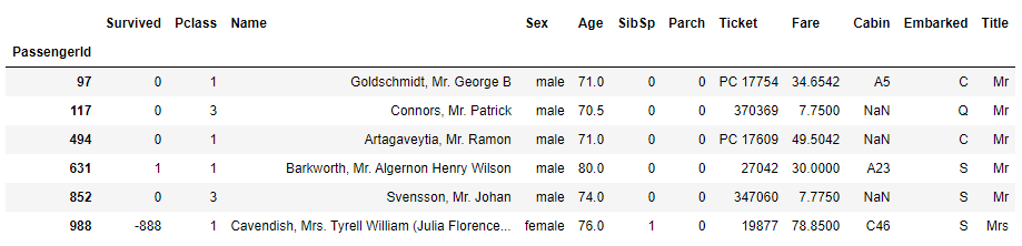
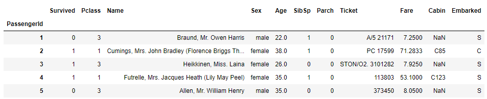
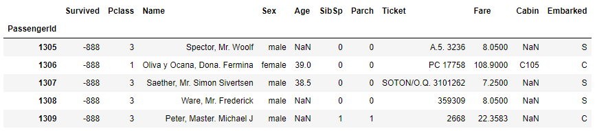
So, in total, we have 1309 entries, 11 columns and data type information for each one in the dataset. Apparently, we have some missing data, which we will analyise and resolve in the proper way. In this step, we just explore the data by using simple functions as .head, .tail, slicing techniques, filtering with .loc. In this way, the basic overview of the data structure is gained.
  # use .head to get top 5 rows
  df.head()
  # use .tail to get bottom 5 rows
  df.tail()
Now we have the general idea of the dataset contents, we can explore more deeply some specific features.
BASIC Exploratory Data Analysis (EDA)
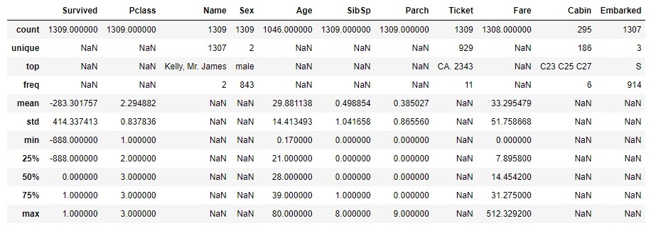
Next, we analyse the summary statistics, depending on the type of the feature: numerical or categorical ones. For numerical features, we analyse the centrality measures (mean, median) and dispersion measure (range, percentiles, variance, standard deviation). For categorical features, we analyse the total and unique count, category counts and proportions, as well as per category statistics. By using .describe functions, including the argument 'all', we get the summary statistics of all features, as follows:
  # use .describe method (include='all' argument) to get a summary statistics
  df.describe = (include='all')
For numerical features, we can analyse the centrality and dispersion measures. Whereas, the categorical ones need to be analysed in a different way. Take for example the feature of Pclass, which represents the class of the passanger. The graph below represents the number of passengers, categorized by the class 1st, 2nd or 3rd.
  # use .value_counts for analysing categorical features and .plot for visualization
  df.Pclass.value_counts().plot(kind='bar', rot=0, title='Class wise passenger count', color='c');
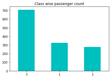
Obviously, we can make a clear conclusion that the highest number of passengers were in the lowest class.
ADVANCED Exploratory Data Analysis (EDA)
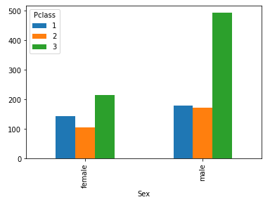
By creating a crosstab and applying it to the Pclass and Sex features, we drive the additional conclusion that the majority of passangers in the third class are the male passangers, exactly number of 493. This is a very handy EDA technique, but its extension would be creating pivots. With pivots, we can add an argument of a function, which could be applied on a specific feature.
  # create crosstab for Sex and Pclass features to get insights, present with bar chart
  pd.crosstab (df.Sex, df.Pclass).plot(kind='bar');
For instance, using the same features, we could create a pivot table by defining the function argument to calculate mean of the value Age.
  # create pivot table by defining 4 arguments (rows, columns, values and function)
  pd.pivot_table (index='Sex', columns='Pclass', values='Age', aggfunc='mean')
  # or get the same result by using .groupby, .mean and .unstack methods
  df.groupby (['Sex', 'Pclass']).Age.mean().unstack()
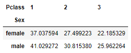
So, the majority of male passangers in the 3rd class are 25.96 years old in average.
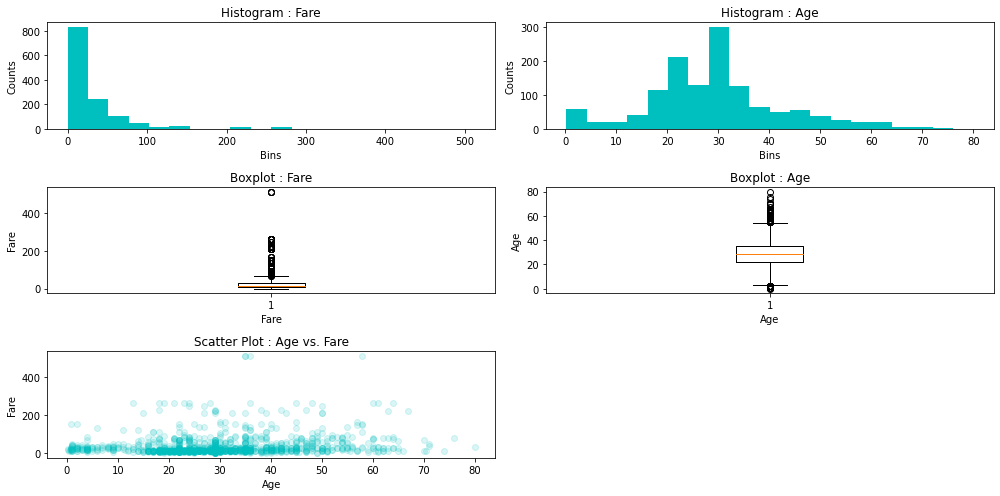
Furthermore, we would like to apply some visualization tools in order to analyse the distribution of the data. Firslty, we make a distinction between an univariate distribution, where we use histogram and/or kernel density estimation (KDE) plot, and a bivariate distribution or a distribution of two features, where we use a scatter plot for visualization. Analysing data distribution, we look into very important aspects of it, such as skewness and kurtosis and its variations to the normal one, which serves as the standard.
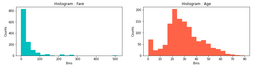
Looking at the histogram of the features Age and Fare, we can see positively skewed distributions or we have their mean values higher than the medians. In terms of Age, this means that 50% of the passangers are older than 28 years and the other half is younger than the median of 28 years. Also, the mean age is 29.88, so, it is slightly skewed in right, meaning there are majority of ages around median, but also longer tail with some very old people, comparing them to the median, shifting the mean age to be slightly higher than the meadian. Similarly, with more positive distribution, logic could be applied in terms of Fare.
DATA MUNGING
Data munging is a very important part of data analysis, which refers to dealing with missing values or outliers. By using .info method earlier, we have already detected some features with missing values (Age, Fare and Embarked, whereas Cabin will be analysed in Feature engineering section). Similarly, while plotting some features, especially Age, we have seen the existence of some extreme values of this feature.
WORKING WITH MISSING VALUES
As we have realised earlier, in Titanic dataset, there are a couple of features with missing values. In terms of possible solutions, we have these techniques at our disposal:
- Deletion - only if few observations have a missing-value issue;
- Imputation - replacing NaNs with plausable data, such as mean, median or mode imputation;
- Forward/backward fill - used in case of time series or sequential data;
- Predictive model;
FEATURE: Embarked
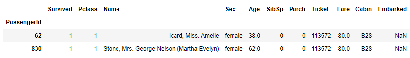
From our previous EDA section, we see that there are two NaN values of this feature in the dataset.
  # use .isnull function to extract missing values
  df [df.Embarked.isnull()]
  # use .value_counts function to count the frequency of embarkment
  df.Embarked.value_counts()
  S    914
  C    270
  Q    123
  Name: Embarked, dtype: int64
So, the highest number of embarkment happened at the S location.
But which embarked point had higher survival count? As both of these passangers survived.
  # use .crosstab technique to discover which embarkment location had the highest survival rate
  pd.crosstab (df[df.Survived != -888].Survived, df[df.Survived != -888].Embarked)
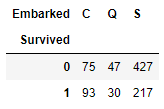
Here, we filter out the survival data with -888 value, which come from test data where we do not have survival information. So, in absolute terms, the embarkment point with the highest survival rate was the S one. Relatively, the result is different.
  # explore Pclass and Fare for each Embarkment point
  df.groupby (['Pclass', 'Embarked']).Fare.median()
As both of these two passangers survived, were in 1st class and with Fare of 80, let's try to use these information as well.
  Pclass  Embarked
       1         C         76.7292
                 Q         90.0000
                 S         52.0000
       2         C         15.3146
                 Q         12.3500
                 S         15.3750
       3         C          7.8958
                 Q          7.7500
                 S          8.0500
  Name: Fare, dtype: float64
From this point of view, we see that it is most likely that these passangers had embarkment point C. Finally, let's fill in the missing values with C embarkment point and check if any null values remain afterwards.
  # replace the missing values with 'C' by using .fillna method
  df.Embarked.fillna ('C', inplace = True)

  # check if any null values exist with .isnull, after .fillna was applied
  df [df.Embarked.isnull()]
Great! We have solved the first feature with a missing-value issue.
Let's tackle the rest!
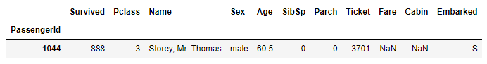
FEATURE: Fare
We will use similar approach to the feature Fare, as we did in the previous section. So, spot the missing values, use existing information we have and draw some conclusions.
  # check if any null values exist with .isnull
  df [df.Fare.isnull()]
  # filter the passangers with Pclass = 3, Embarked = S, including the application of .median function to the Fare value
  median_fare = df.loc [(df.Pclass == 3) & (df.Embarked == 'S'), 'Fare'].median()
  print (median_fare)
8.5
We will use imputation method to deal with missing value of Fare, based on median Fare that was applied for the passangers from the 3rd class and embarkment point S. In the following step, we fix the NaN value to be 8.5.
  # apply the created median_fare function and replace NaN Fare values with median value (3rd class passangers from S embarkment point)
  df.Fare.fillna (median_fare, inplace = True)]
If we check the number of null values with .info method, we can safely continue with the Age feature.
FEATURE: Age
  # check if any null values exist with .isnull
  df [df.Age.isnull()]
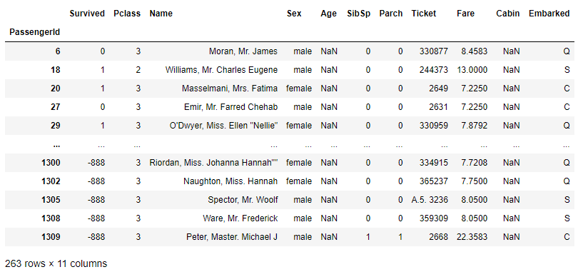
We have exactly 263 rows with missing values of the Age feature. It is a lot of rows, so we should take a closer look of what is the best way to deal with this issue. Whether we should apply mean, median age of the passangers or some more complex logic. Let's find out!
Previously, we have analysed the data distribution of the Age feature. We have seen some of very high values with passangers which are over 70 and 80 years old. So, these extreme values could easily impact the mean Age value. But, we will check, what are the mean and median values, just to have in mind the figures.
  # get the Age mean value
  df.Age.mean()
29.881137667304014
  # get the Age median values, by Sex category
  df.groupby ('Sex').Age.median()
  Sex
  -------------------------
  female    27.0
  male      28.0
  Name: Age, dtype: float64
It is useful to apply some visual tools for further analysis. We will use boxplot technique to discover more details.
  # visualize Age notnull values by Sex category, using boxplot
  df [df.Age.notnull()].boxplot('Age', 'Sex');
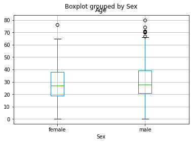
The plot shows similar result for both, female and male passangers, in terms of age data distribution. So, we continue to dig further.
  # visualize Age notnull values by Pclass category, using boxplot
  df [df.Age.notnull()].boxplot('Age', 'Pclass');
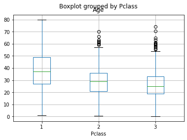
Now we see some difference in the Age levels between the Pclasses of the passangers. But, at this point, we want to track a passanger's title and try to see its correspondence with the age difference. Let's try to extract this insight from the data!
We will now explore the Name values, extract the title from it and make a dictionary for titles, group titles in a couple of bins, so we could more easily drive some new conclusions. Whether we find some new variances of the age, depending od the passangers' titles, we could be on the right path.
  # explore the Name feature
  df.Name
  PassengerId
  1                                 Braund, Mr. Owen Harris
  2       Cumings, Mrs. John Bradley (Florence Briggs Th...
  3                                  Heikkinen, Miss. Laina
  4            Futrelle, Mrs. Jacques Heath (Lily May Peel)
  5                                Allen, Mr. William Henry
  ...
  1305                                   Spector, Mr. Woolf
  1306                         Oliva y Ocana, Dona. Fermina
  1307                         Saether, Mr. Simon Sivertsen
  1308                                  Ware, Mr. Frederick
  1309                             Peter, Master. Michael J
  Name: Name, Length: 1309, dtype: object
  # create the GetTitle function -> to extract the title info from the name
  def GetTitle (name):
      first_name_with_title = name.split (',')[1]
      title = first_name_with_title.split ('.')[0]
      title = title.strip().lower()
      return title
WORKING WITH OUTLIERS
One more data quality issue is a presence of outliers or extreme values. There are also a couple of techniques which could be used in order to deal with such values. We will take a closer look into the features Age and Fare, since we have spotted some high values of these variables earlier.
FEATURE: Fare
If we recall the previous histogram visualisation of the Fare feature, we should have in mind the existence of some extremely high values. Let us pay more attention to those values. Firstly by plotting the box plot:
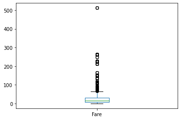
We can see some really high fares, around 500 value. To be exact, let's extract the top fares:
# extract the Fare TOP outliers
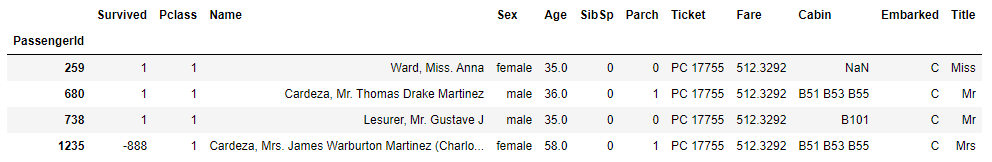
df.loc [df.Fare == df.Fare.max()]
The highest fare is exactly the value of 512.3292. As we know that fare could not be negative, we apply log transformation technique so we make it less skewed. Let's apply the numpy log function to the passangers' fare.
  # apply log transformation to reduce the skewness, add 1 for zero fares
  LogFare = np.log (df.Fare + 1.0)
  # plot the LogFare to check the skewness
  LogFare.plot (kind='hist', color='c', bins=20);

This is now less skewed distribution. Furthermore, we will apply the technique of binning in order to categorize the fare feature into 4 bins, so we treat these outliers more conveniently. In pandas, we use qcut function to achieve this. The qcut comes from 'Quantile-based discretization function', which basically means that it tries to divide up the data into equal sized bins.
  # apply the binning technique by using .qcut function
  pd.qcut (df.Fare, 4)
  PassengerId
  1         (-0.001, 7.896]
  2       (31.275, 512.329]
  3         (7.896, 14.454]
  4       (31.275, 512.329]
  5         (7.896, 14.454]
  ...
  1305      (7.896, 14.454]
  1306    (31.275, 512.329]
  1307      (-0.001, 7.896]
  1308      (7.896, 14.454]
  1309     (14.454, 31.275]
  Name: Fare, Length: 1309, dtype: category
  Categories (4, interval[float64]): [(-0.001, 7.896] < (7.896, 14.454] < (14.454, 31.275] < (31.275, 512.329]]
  # add bins' labels or discretization = turn numerical into categorical feature
  pd.qcut (df.Fare, 4, labels=['very_low', 'low', 'high', 'very_high'])
  PassengerId
  1        very_low
  2       very_high
  3             low
  4       very_high
  5             low
  ...
  1305          low
  1306    very_high
  1307     very_low
  1308          low
  1309         high
  Name: Fare, Length: 1309, dtype: category
  Categories (4, object): ['very_low' < 'low' < 'high' < 'very_high']
# plot the labaled bins
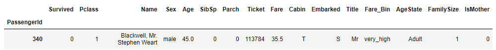
pd.qcut (df.Fare, 4, labels=['very_low', 'low', 'high', 'very_high']).value_counts().plot (kind='bar', color='c', rot=0);
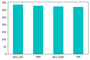
By using the qcut pandas function, we categorized the fare numerical values into 4 buckets and turn it into categorical feature of 4 bins: 'very_low', 'low', 'high' and 'very_high'. As we look at the bar graph, we see there are similar number of observations in each bin. Finally, we will create new variable 'Fare_Bin' and store it into dataframe for possible future analyses.